Editors’ note, Nov. 16: Apple has rolled out a low-power mode for workouts which extends the Apple Watch Ultra’s battery life even further. Along with its great fitness-tracking features, bright screen and durable design, we’ve awarded the Apple Watch Ultra an Editors’ Choice. Our review, originally published in September, follows.
Even if you’re not an endurance athlete, there’s still plenty of reasons you might want the $799 (£849, AU$1,299) Apple Watch Ultra. It has a bigger battery, more durable titanium casing and a screen that’s twice as bright as the Apple Watch Series 8. Like the iPhone 14 Pro, Apple has reserved some key features for the Ultra that set it apart from the rest of the Apple Watch range. There’s a dual-frequency GPS for more accurate tracking, extra microphones for improved voice calls and a customizable Action button to quickly start activities, or transition from one leg of a triathlon to another.
For the first time on an Apple Watch, LTE connectivity is included by default. That immediately sets it apart from many other sports and fitness watches that don’t have any cellular option. The Ultra only comes in one 49mm case size, which might be too big for some to wear comfortably.
Then there’s the hefty price, which is $400 more than the 41mm GPS Apple Watch Series 8 and could have you wondering whether the Ultra really is worth that much more. Even if you don’t consider yourself an adventurer, there might be enough here to justify the cost — especially if you want a more-durable watch with increased water resistance and battery life that’s at least twice as long as other Apple Watch models.
Considering the $749 45mm Apple Watch Series 8 in stainless steel costs almost as much, I think the Ultra is a better overall value, given that you get additional hardware features like the Action button (which I’ve come to love), an emergency siren and extra microphones to boost call quality.
It’s also priced competitively with other sports watches that have a similar titanium construction and OLED screens, like the $999 Garmin Epix 2. The Apple Watch Ultra’s battery doesn’t last as long, and it doesn’t have anywhere near as many navigation features as the Epix 2. But it’s easier to use, has heart features like an electrocardiogram (ECG or EKG) app, cellular connectivity and seamless integration with the iPhone.
If you’re someone who wants a true hybrid smartwatch and sports watch, the Ultra is the one to beat.Buy an Apple Watch Ultra interest-free with monthly payments on the Apple Card: $799 at Apple
Apple Watch Ultra design is big and bold
The Ultra is a souped-up Apple Watch in every respect. All the familiar elements are here, just bigger and bolder than previous models. The side button has its own housing that protrudes from the case and the digital crown has deeper ridges, making both easier to control if your fingers are sweaty, dusty or wearing gloves.
When taking the Ultra out of the box for the first time, I thought it was going to be too large and heavy for my wrist. But it’s deceptively light to wear, thanks to its titanium construction. Even with the smallest watch strap that best suits my wrist size, I’m able to get a snug and comfortable fit during the day.
This isn’t a one-size-fits-all design, though. The Apple Watch Ultra will likely overwhelm smaller wrists. I would have loved to see a smaller case option, even at the expense of battery life. For example, I’m a side sleeper who rests my hand under my pillow, so the Ultra isn’t the most comfortable watch to wear for sleep tracking; I can feel every edge of the watch at night.
The 49mm case makes this the biggest Apple Watch to date, though the active area on the display itself is only a hair bigger than the 45mm Series 8. So rather than a bigger screen, you’re really choosing the Ultra over the Series 8 for the extra protection you get from the titanium casing’s raised edges. The screen also has flat edges, which some might prefer over the slightly curved screen on Apple’s other watches.
The Apple Watch Ultra is also twice as bright as the Series 8 and is easy to see on a sunny day with a maximum 2,000 nits. I’ve taken the Ultra on long hikes, an outdoor bike ride and my everyday walks and runs. It’s readable in all of these situations, especially when just glancing down to see stats on the always-on display. The flat sapphire glass cover is more reflective than I’d like, but the edge protection around it will pay dividends in long-term durability.
Coming from a 41mm Apple Watch Series 7, everything is easier to see, from workout stats on the always-on display to notifications. The font size is adjustable and can get big, which is great for readability, similar to the 45mm Series 8. And it sounds simple, but I like how the Ultra has room on its screen for up to six lines of workout stats. I no longer have to scroll down to another page just to see a particular metric, which makes all the difference.
Over the past week, I have gotten used to the size of the Ultra, though there are times when I missed the sleeker feel of the regular Apple Watch on my wrist. That’s especially true for the Series 7 and Series 8, with their curved screens and contoured cases that make everyday wear more enjoyable.
Apple Watch Ultra’s Action button has plenty of uses
You can’t miss the bright orange Action button on the left of the Apple Watch Ultra. It sits flush with the case and has an indentation that helps you feel it under your thumb. Next to the larger capacity battery, this is my favorite new hardware feature on the Ultra. It’s going to be hard to go back to an Apple Watch Series without one.

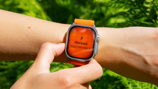
On previous Apple Watches, I set a complication to launch the workout app, then select the workout type using the touchscreen. It’s not only easier to do this with the Ultra’s Action button, but it’s far more customizable because the button also changes depending on context.
If you’re on an outdoor run and press the Action button again, you can mark a segment. You can also pause a workout by pinching the side button and Action button together. The same pinch combo resumes your workout, so there’s no need to swipe to the right on the screen to stop and start (although you still need to swipe to end a workout). The button can also transition from one leg of the race to another if you’re participating in a duathlon or triathlon.

I wish that the other two buttons could be used for controlling and navigating the watch (particularly if you can’t use the touchscreen with gloves), or locking the screen during a workout like you can on some other sports watches. As with other Apple Watch models, you can only lock the Ultra’s touchscreen if you’re doing an underwater activity such as swimming or diving.
I’d like to see Apple add some of these customization features into other Apple Watches, so you could swap out the multitasking function of the side button to launch a workout instead, for example. Other sports and outdoor watches have similar ways to customize buttons, such as the hot keys on Garmin watches. But Apple’s implementation is arguably easier to use, and I hope to see even more customization options added in future software updates.
You can also use the Action button to launch Shortcuts once you’ve set up the app on your iPhone and I love the additional flexibility this gives. One of my favorite ways to use a Shortcut has been to get Apple Maps directions home from a set location when I have a signal, like when I’m on a bike ride in the city and just want to find the best route home without using my phone.


