With sloping ceilings and few usable walls, turning an attic into a livable space is always tricky. Combine those quirky angles with a client who changed direction midway through the renovation, and many designers might have been tempted to throw in the towel, but not Hollie Velten. The interior designer was unfazed when her client Molly Rodau’s plans for the top floor went from a project with a single function to one with three.
When Rodau first approached Velten about her attic conversion, she was hoping to transform the bonus space into a “peaceful, calming place” for her leadership building and executive coaching business. Rodau had already added skylights and tasked a carpenter with creating storage beneath the lower portion of the eaves, but she needed help from a pro to figure out how to make the most of the awkward area, especially since it would serve as the backdrop for her client calls. Then, months into the design process, she decided to move her HQ out of the house and instead use the third floor as an occasional office, guest room, and play zone for her and her partner Daniel’s 4-year-old son, Dax. Ahead, Velten takes us through the new and improved reno.
Invest in Shape-Shifting Furniture
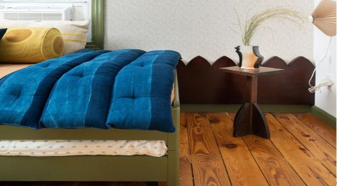
After combing local shops for small-space–friendly bed ideas, Velten landed on IKEA’s stackable Utåker product, which, when taken apart, gives the family the flexibility of deciding between a double mattress, two slumber party–proof twins, or a corner sofa. The designer wanted to make it feel custom, so she painted it in Farrow & Ball’s Bancha (a rich olive green) and decked it out in an oversize bolster made from Block Shop’s Sunwave fabric. To give the setup even more presence in the room, Velten commissioned a bespoke, gothic-inspired headboard from her favorite local cabinet builder.

Mark Your Change
The designer strategically used the same green paint from the bed for the room’s window trim, baseboards, and a bookcase in order to create a continuous color thread. Not only does the single hue immediately unify the architecture and furniture, it acts almost like a highlighter for the overall design, marking the thoughtful updates that have been made.
In a room with many doors like this, Velten says, “You can do your best to make them disappear or lean into it.” She clearly chose the latter when it came to the openings leading to the crawl space. The bold trim and oversized knobs turn the fronts into a statement feature—there’s no need to get spooked about opening them up and grabbing something inside. “Like everything else in the room, we tried to make them more fun but quietly so,” she adds.
Turn a Flat Wall Into a Focal Point
The wonky roofline might be a nuisance when you’re trying to stand upright, but it has its perks, too: It is an established focal point from the get-go. Here, Velten took advantage of that by wallpapering the surface in a subtle squiggly print from Farrow & Ball and positioning the custom zigzag headboard piece underneath the window. Centering the mattress beneath the peak and styling it like a sofa with the cushions in the middle creates strong symmetry that draws the eye in.

Shop Vintage
Thrifting furniture was a choice Velten made with sustainability in mind, but also Rodau’s guests. The trestle table from Olde Good Things, tubular steel chair from Cherin Studio, and iconic Componibili storage unit support Rodau’s work-from-home setup but don’t scream “office,” so no one will feel like they’re intruding when they’re invited to spend the night.
Avoid Hitting the Ceiling With Custom Storage
Originally, Velten had planned on extensive bookcases for Rodau’s work library, but with the bulk of the books headed to her new office, the designer pared back to a single freestanding unit. Constructing it from scratch made sense so that she could maximize every inch of the corner and also add features that most off-the-shelf products don’t have, like an open top that accommodates extra-tall titles. The sky is the limit now.


