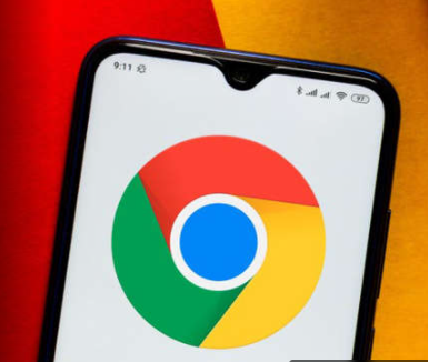
Let me start this off by saying that I am not a designer. I have no problem admitting that my eyes are not nearly as well trained as those of the very qualified and brilliant people who work in this area. Nonetheless, I think I can speak for more than one person when I say that I really don’t see much of a difference between Google Chrome’s new icon and its old icon.
Chrome’s new icon started making the rounds online on Friday after it was shared by one of the company’s designers on Twitter. The big news was the “refresh” itself, as it’s the first update Google has given the Chrome icon in eight years. The new icon also appeared in Chrome Canary, the company’s browser for developers and early adopters.
To my untrained eyes, at first glance I couldn’t really see a big difference between the 2014 version of the Chrome icon, which is the one we’ve lived with until now, and the 2022 version. The colors do look brighter and the blue circle bigger. In fact, I would say the whole thing is crisper. After that I’m out of comments.
Luckily, Chrome designer Elvin, or @elvin_not_11 on Twitter, was ready to educate the layfolk on the main design changes.
“We simplified the main brand icon by removing the shadows, refining the proportions and brightening the colors, to align with Google’s more modern brand expression,” Elvin wrote on Twitter. “[W]e also found that placing certain shades of green and red next to each other created an unpleasant color vibration, so we introduced a very subtle gradient to the main icon to mitigate that, making the icon more accessible.”
According to Elvin, there will be specific versions of Chrome’s new icon for each operating system. For Windows, the icon will have a gradated look, but it will feature brighter colors with no gradients on Chrome OS. Meanwhile, for the Mac folks, the icon will look 3D. Chrome’s other apps, Beta and Dev, have also gotten a refresh.
Google wasn’t closed to creating a Chrome icon that was more different than the one they settled on, though. Elvin said the team considered creating an icon with more negative white space but decided against it because it shrunk the icon and made it difficult to identify alongside other Google apps. (I honestly like that one better, even though I would definitely have gotten lost trying to find it).
In the end, Elvin addressed that burning question: Why bother with something so subtle?
“We tailor Chrome’s experience to each OS, with features like Native Window Occlusion on Windows, day-one M1 support on macOS, Widgets on iOS/Android, and Material You on Android,” he wrote. “We want our brand to convey the same level of care.”
To that I say, well, OK. I get it. Although I’d wager that if they refreshed the icons and just didn’t announce it, few people would have noticed the difference. Yet again, there are a lot of designers out there with sharp eyes, so who knows.
The refreshed logos will start appearing in the Chrome app and on the web in the next few months.
Microsoft may earn an Affiliate Commission if you purchase something through recommended links in this article.